Little improvements can make a big change when it comes to how your online patrons experience buying tickets. You can make the experience easier and more pleasant by making a few simple changes to:
- Update your logo
- Select a background color or image closer to your branding and colors that helps your content pop
- Using simpler, more easy to read seat symbols on your seating chart
All of these changes are extremely easy to do and will give a you a big return as your patrons will have a better buying experience.
All we need is a screen shot with notations, and the hex codes for any specified colors.
Let’s talk about these one by one.
Your logo
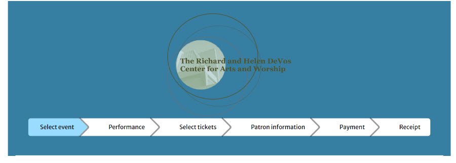
Is your logo the most current one? How does it look on your Webtix page? How does it look on your background?
Take a look at this:
The logo contains fine lines, black text, and a subtle green design. It isn’t very readable and doesn’t present well as a symbol of a prestigious organization that has something valuable to offer you when paired against a blue background.
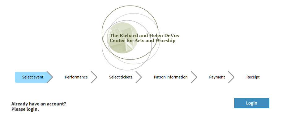
What happens when you change the background color?
See how much more readable and more attractive it is? You need to consider how your logo appears on your Webtix page and what it communicates to your patrons.
Speaking of background colors and images
As you can see from above, the background can make a huge difference in how the Webtix page displays and how readable it is.
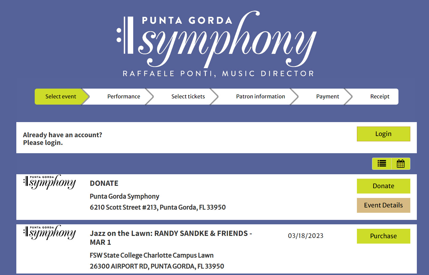
In the example below, here is the Webtix page for Punta Gorda Symphony.
See how the purple background is the same brand color they use on their website? Visitors feel connected to the symphony website and experience, even when they are actually not on the organization’s website buying tickets.
Here is another example. Look closely and you’ll see what look like stars on the dark blue background of this Webtix page.
It matches the starry blue background on their website.
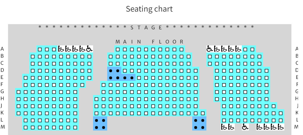
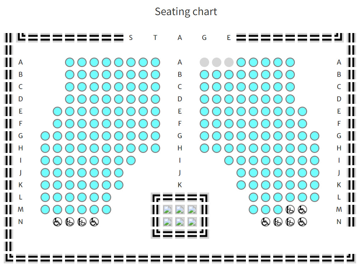
Last, let’s talk about improving the look of your seating chart on Webtix. The default look of seating charts on Webtix looks like this:
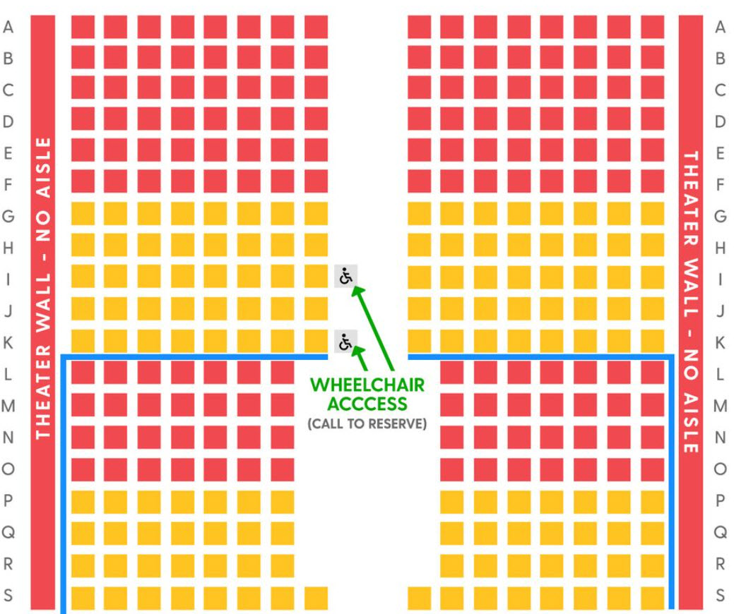
But it could look like this:
Or this!
You are only restricted by your imagination.

