(Last updated on: March 6, 2014)
The SIM interface in Webtix takes a purchaser to a Payment Gateway hosted page to process a credit card. This ensures Webtix adheres to all security protocols without a prohibitively costly certification process that would increase the cost of our products dramatically.
It’s quick, easy and many of your patrons won’t even realize the difference. However, the webpage looks different and you will want to customize it a bit for a more branded experience.
The following instructions are for those using Authorize.net as their payment gateway. If you are not using Authorize.net, contact your credit card processor to learn how to customize their page.
At Authorize.net, the default interface is black lettering on a white background. There are many fields that can be edited and improved. Here’s how:
Log into your Admin interface. Click on Account | Settings | Payment form.
Color and font settings
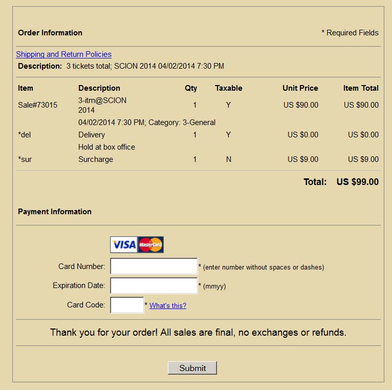
When you click on the color and font settings, you can change the information you and your customers see. In particular, you can change the background to HEX color code E6D8AE This will give a tan background that is much easier on the eyes (this
is the same color Webtix uses).
Payment form – fields
You probably do not want all the customer’s information to be displayed for them to edit. The card code and description is all you need. Simply uncheck the boxes you do not want
to show. Note: The information is still sent as HTML hidden fields.
Security code
If you check this, your customers with be asked to enter a “security code” (usually called a captcha). You may have encountered this when a webpage shows you a bunch of squiggly letters and numbers and ask you to decipher and enter them in a box. Most of our customers do not want to limit their customers. So, don’t check it.
Shipping and return policies
This is where you can link to your policies URL on your website. For
most of our customers, the policy is usually simple: “No exchanges, no
refunds.” If you are going to have this kind of information, make sure you include it
in your emailed receipt.
Header and footer
The header and footer are similar. The information is to benefit your
customers. This is information that should also go in your emailed
receipt.
What it looks like when it’s done:

